Confessions of a first-time GIS user: part two

In part one I gathered the plans, scanned them, georeferenced them, and promptly set every single one to the wrong coordinate reference system. So before anything else, the payoff I promised: what a CRS actually is, and why getting it wrong sent my work to the wrong place on the planet.
A coordinate reference system is the agreement your map makes about how to turn a position on the round Earth into a flat pair of numbers. Some systems measure in degrees of latitude and longitude. Others, the projected ones, measure in plain meters on a grid. For Timgad I use EPSG:32631, which is WGS 84, UTM zone 31N. The important part of that mouthful is that it measures in meters. When I draw a wall and the software tells me it is 4.2 meters long, that is a real distance on the ground, not an abstraction. Choose the wrong CRS and the units stop meaning anything, which is exactly how I ended up watching carefully placed plans drift off to the wrong spot on the map. Set the right one, and the whole stack of drawings and satellite images finally agrees on where Timgad is.
With that fixed, the real work could start. And here is where I have to correct my past self, because the plan I described at the end of part one is not quite the plan I ended up following.
From footnotes to features
The single most important thing to understand about this stage is that I did not sit down in front of a blank satellite image and start hunting for houses. All those months of reading I confessed to in part one, the ones I half-apologized for as procrastination, turned out to be the entire foundation of this step.
Because of that reading, I already have a database. Seventy-four houses so far, and counting, because the deeper I get into the sources the more I turn up, so the total keeps creeping upward even as I work through it. Each one is an entry I built by reading the excavation reports house by house before I ever opened QGIS, and each entry already tells me what to expect. This house has a peristyle court. That one has water features, a cistern in the middle of the court and a well tucked into the northwest corner. This one has mosaic pavements catalogued by Germain in 1969. That one has a staircase, which means it once had a second storey. Every house comes with its plan source noted too, a specific figure in Germain, a numbered plate in Ballu 1903, so I know exactly which drawing to pull up when I need it.
So digitizing is not discovery from scratch. It is placing what I already found in the text onto the ground, and then testing one against the other. And that test runs both ways, which is the part I find most interesting. Part of the point of this project is to see where the early excavators got it right and where they got it wrong, so I am never simply copying their drawings, and never simply trusting the satellite either. The two sources argue with each other constantly, and learning how to referee that argument turns out to be its own skill, one I will come back to shortly. What I will say here is how good it felt to realize that the “home” work, the textual analysis I kept retreating into, was quietly building the very thing I now draw from.
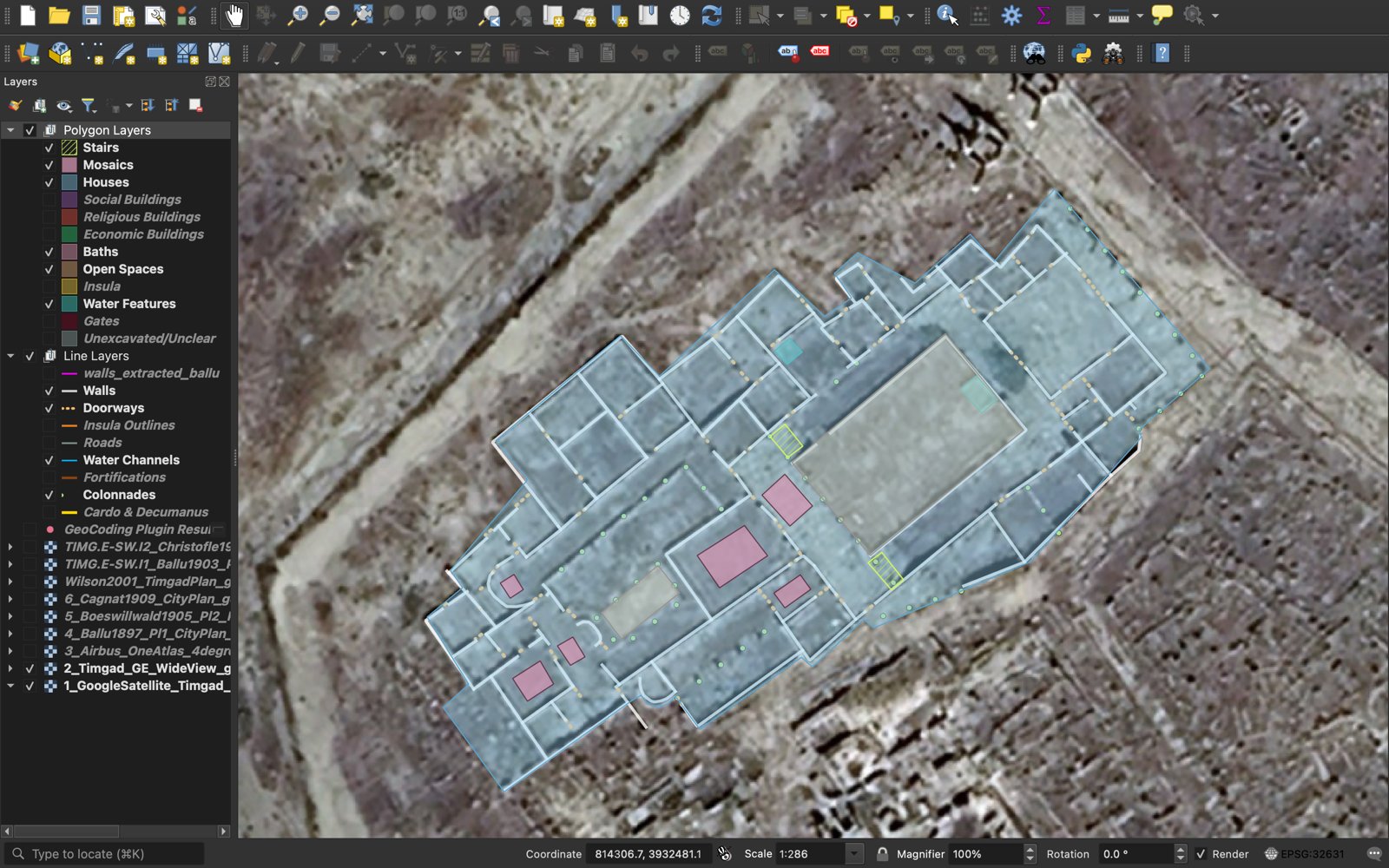
To keep myself honest and moving, I made a checklist, one entry per house, with a running tally at the top that I find equal parts motivating and alarming: completed, 11 of 74. The first I finished was the Storehouse (Entrepôt). Eleven done, sixty-three to go, and even that number is a moving target, because every pass through the sources tends to add another house or two to the far end of the list. The more I work through, the more I find. I have decided to treat all of this as momentum rather than a sentence.
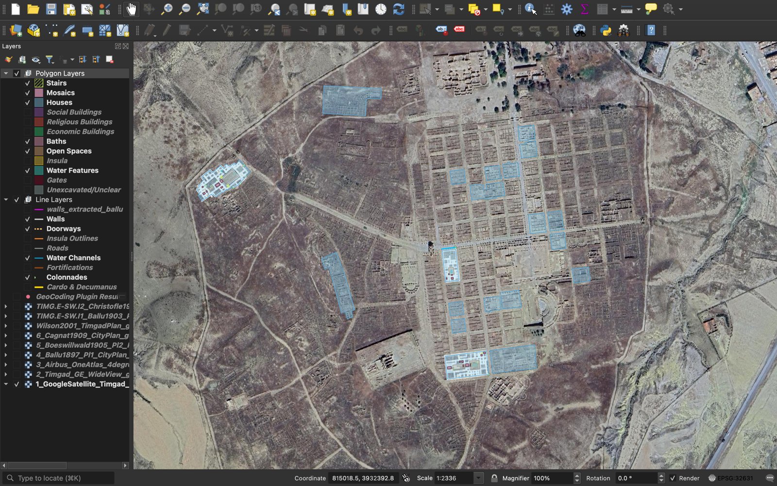
Polygons for space, lines for structure
The next decision was the least glamorous and the most consequential, and it is where I changed course from the plan I sketched at the end of part one. I had said I would trace only bare walls first and leave everything else for later. In practice, drawing a house well means drawing several kinds of thing at once, and the trick was deciding which kind each thing is.
Some things I want as areas I can measure. The footprint of the house, the open court at its center, a mosaic pavement, a cistern, a flight of stairs. These become polygons, closed shapes with a real surface area in square meters, each living in its own labeled layer. Other things are really just lines. A wall is a division. A doorway is a gap in that division. A colonnade is a row of columns along a stylobate. These stay as lines, thin and honest, no fill.
So my QGIS project is a stack of color-coded layers sorted by exactly that logic. On the polygon side: Houses, Open Spaces, Mosaics, Water Features, Stairs, Baths, and the other building types, each with its own color. On the line side: Walls, Doorways, Colonnades, Water Channels, Roads, and the rest. Drawing a single house means moving down its checklist and adding to each relevant layer in turn: the footprint into Houses, the peristyle court into Open Spaces, the cistern and well into Water Features, any pavements into Mosaics, the portico into Colonnades, then the walls and the doorways. Every feature carries a few attributes as I place it, the insula grid ID, the plan source, a type, so that the map is a database I can query later, not just a pretty picture.
One honest caveat before any of this starts to sound too settled… I am not a GIS expert, and this is genuinely my first time doing any of it, so please read all of the above as one person’s working setup rather than a how-to. This is a share-as-I-go kind of space. The scheme I landed on is the one that made sense to me, shaped by how I happen to think about space and by the fact that I care a great deal about accessibility and about the small features inside a house, the thresholds, the courts, the water. Someone with different questions, or a different feel for space, might reasonably slice all of this a completely different way, and that would be just as valid. Should you set your project up like mine? Not necessarily. I am only showing what has been working for me as I go, mistakes included, so that hopefully you will not repeat them yourself and set your CRS to the wrong coordinates like I did, although hey, that is all part of the learning process too.
The dance of interpretations

The century of published plans I chased down in part one are not simply what I trace from, and the satellite image is not simply the truth. The real work sits in the tension between the two.
I draw on top of the Google Earth satellite imagery, because it shows where the stones sit today, in their true coordinates. But what we see “today” is not necessarily the most reliable state of evidence either. Timgad was last properly lived in over a thousand years ago, before it was abandoned after the Arab conquest and slowly buried by the plain around it. That is a very long time for walls to erode, for stone to be robbed and carried off to build elsewhere, and more recently for excavation, tourism, and restoration to rearrange what is standing. So the satellite does not show me the Roman house. It shows me what is left of it, plus everything that has happened to it since.
This is exactly why the old plans still matter, and sometimes matter more. An excavator drawing in 1903 saw walls that have since worn down to nothing, or been carted away, or been buried again. For those features the historical drawing is the better record, and the satellite is the one that is wrong, or rather, too late. So I keep the plans stacked in my layer list as georeferenced images I toggle on and off, Ballu 1897, Boeswillwald 1905, Cagnat 1909, Wilson 2001, Germain, the high-resolution Airbus imagery, and I consult them constantly.
But the plans get things wrong too, and this is the other half of the dance. Excavators made mistakes. Sometimes a wall is drawn where the satellite shows there was never one. Sometimes a wall that plainly exists on the ground is left off the plan entirely. Sometimes the explanation is honest error, sometimes it is a later restoration that added or moved stone, sometimes it is one plan quietly copying another plan’s mistakes forward for decades. Some plans line up with the satellite better than others, and working out which to trust in which part of the city is something I am still assessing myself, especially out on the eastern side, where the distortions seem to get worse. Part of the craft, it turns out, is knowing which source to believe in which neighborhood, and being willing to record, in my own data, that I made a judgment call rather than found a fact. This is where confidence levels earn their keep. Every feature I draw gets a certainty rating, probable, confirmed, or uncertain, plus a short note in the attribute form that pops up the moment I finish it, so the map remembers not just what I decided but how sure I was and why, which future me, and anyone reading the data later, will need.
What counts as a wall
This is the question I did not know I was signing up for, but it is the one I think about most…
A wall on a satellite image is rarely a clean line. It is a smudge of stone a meter or two wide, sometimes standing, sometimes a robbed-out trench, sometimes a shadow pretending to be masonry. So tracing is a constant series of small judgments. Is that a real division or a later intrusion? Is that gap a doorway, or just a place where the wall has fallen? Where exactly, within that two-meter smudge, does my one thin centerline belong? I trace external walls and internal walls, and I mark the doorways as short lines across the gaps, and every one of those is a decision I am quietly making on the archaeology’s behalf.
Two settings keep me honest. The first is snapping, which makes my cursor jump to an existing point when it gets close, so that when two rooms share a wall, they truly share it, rather than my drawing two slightly different lines a few centimeters apart. The second is topological editing, which means QGIS treats those shared edges as genuinely shared, so the geometry holds together as one connected fabric instead of a pile of loose sticks.
The machine offered to help, sort of
I never planned to hand the actual drawing over to a machine. The judgment calls are the whole point of this stage, and I knew from the start that I would be the one making them. But I was curious whether a computer even could trace a plan like this, so I tried it purely as an experiment. The Ballu 1897 plan is a high-resolution scan of black ink on white paper, which is exactly the kind of thing software should be able to read, so I wrote a short script that finds the dark ink pixels, thins them down to one-pixel centerlines, and traces them into lines automatically.
It worked, technically…
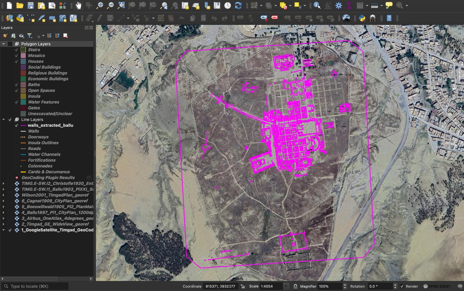
It produced more than five thousand line features in a few minutes, and the city grid was clearly recognizable in the result. It also faithfully traced the plan’s title text, its scale bar, and assorted decorative flourishes as if they were architecture. The automated version now sits in its own separate layer, well away from my hand-drawn work, where it serves as a useful cross-check rather than a shortcut. The honest lesson, and the one I already suspected, was that the machine is fast and tireless and has no judgment whatsoever, and judgment is the entire job. Which is exactly why the drawing was always going to be mine to do by hand.
That said, code still earns its place here, just not for the drawing itself. The part of QGIS I have come to rely on most is its built-in Python console, which lets me make broad changes in one pass instead of clicking through hundreds of features by hand. When I need to pre-fill the same attributes on a batch of new features, relabel every wall in an insula, or correct one field across a whole layer, a few lines of Python do in seconds what would otherwise be an afternoon of clicking. Drawing is where the judgment lives, so I keep that manual, but the repetitive bookkeeping around it is exactly the kind of thing worth handing to a script. Just how much I lean on code, and increasingly on AI, to move faster without giving up that judgment is a whole thread of its own, and it is exactly where my next post goes.
One house at a time
The work is simple in shape and a little daunting in size: the whole set, house by house, off the checklist. It is a marathon, not a sprint. The first house, the Storehouse (Entrepôt) pictured above, took me three to four hours, most of it not drawing at all but the dance of interpretations, deciding whether the mosaics counted, whether the water features needed drawing, polygon or line. The House of Sertius (Maison de Sertius) took two hours, then it settled toward an hour and a half for the House of the Pool (Maison de la Piscina), and I am now at about one hour per house. Bare outlines would take ten or fifteen minutes; mine take longer because I trace far more. I’m working off of imagery only thirty centimeters to a pixel, so I am forever toggling layers (and squinting to no end) to tell a wall from a shadow. The pace keeps improving though, and I should reach thirty minutes a house before long, which is a relief with sixty-three still to go…
I am also drawing the houses outside the walls, not just the tidy grid within them, because those peripheral neighborhoods are the understudied ones, and that is exactly where this project might have something new to say. A database of only the easy, well-published houses would just repeat what is already known.
What is next
When the last house is drawn, I will finally have the thing this whole stage was for: every house in Timgad in one place, anchored to the real world, measurable, and carrying everything my archival research found attached to it in the right spot. Walls and doorways, courts and cisterns, mosaics and stairs, inside the grid and out. Then I can start to read these houses spatially, asking how people moved through them, and where work and home met under one roof.
For now, the lesson from part one still holds, just with better software. I started before I felt ready, I drew my first house imperfectly, I redid more than a few walls, and the work got better the longer I stayed with it. The houses are slowly appearing on the map, one carefully placed line and one patient polygon at a time.
If you need me, I will be nose to the screen somewhere in the second century, asking a smudge of stone, very politely, whether or not it is a wall.
Also shared on Instagram.